The idea
My first encounter with logo/identity design was when I took on the challenge of designing the new logo for the R-Ladies Buenos Aires chapter. During the creative process, we brainstormed with the other organizers, seeking to capture features that represent the City of Buenos Aires and embody the spirit of R-Ladies.
After careful consideration, we chose the Floralis Genérica, a sculpture located in the United Nations Square. Created by Eduardo Catalano in 2002, the sculpture pays homage to flowers 🌷 and reflects the dynamism of our times with its movement. In the flower, we found a beautiful analogy to the sense of community, where the different petals/persons are part of a structure surrounding something valuable. And, like the petals, we are also in constant movement towards increasing gender inclusion and gender diversity in the R community.
The process
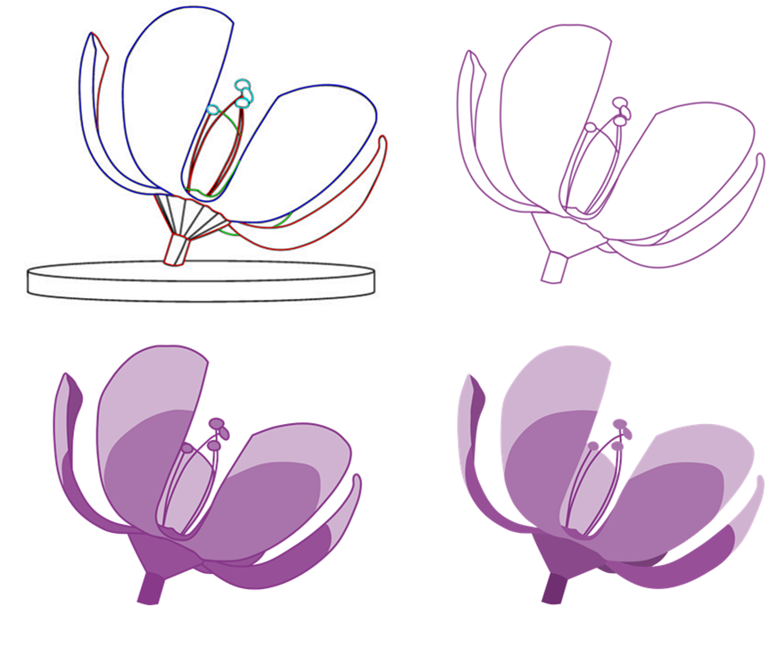
The process involved several steps, both in the design of the flower and the hex. The first thing to do was drawing all the contours of the flower in different colors according to the different structures. Then, some outlines were removed, simplifying the structure. The final steps included filling the contours in different shades of violet and, lastly, removing the outlines for a simpler image.

Steps involved in the process of the Floralis drawing.
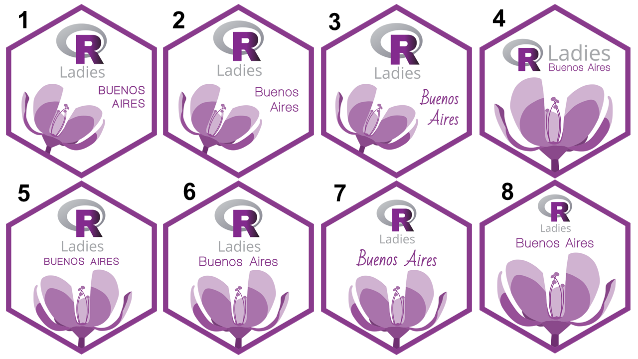
Lastly, we had to decide the position of the Floralis and the text in the logo. This also was quite a challenge since there were so many options!!!!

Some of the MANY options of logos created.
The final logo
After careful consideration, we decided to portray the flower coming from the side, paired with a simple and stylish font style. We were really excited with the final outcome!

The new logo for the R-Ladies Buenos Aires chapter.